
Saturday, 21 January 2017

Sunday, 1 January 2017
Film Magazine Drafts and analysis.

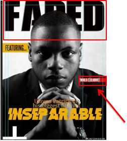 Starting with the masthead, the first magazine front cover, I had created a slit through the word faded however after deliberating on the masthead, I realised that I just wanted that normal version of the text that stayed at the back of the image.
 Also, the Words underneath the masthead, I was definitely going to use for the final Product.
In my other magazine front cover the barcode, in my opinion, was flat and did not look like it fit in the magazine, therefore, I placed the barcode on the right lower end of the magazine coupled with small texts of both the date and price of the film magazine.
In terms of the title of the magazine, I kept it the same throughout.
Film Magazine Drafting Process.


This Process demonstrated how I constructed my Film magazine front cover and the decision I made along the way.
Tools used:
Photoshop for editing both Image and constructing the Front Cover
Canon Camera (to take the images with)
Tuesday, 6 December 2016
Film Magazine Plan
Main image: What is the main image going to be? What type of shot composition/angle etc?
- The main image is going to be one of the main actors, either the protagonist or the antagonist within the film.
- close up shot of the actor, displaying mise-en scene of a suit.
- actor conforms to conventions by looking straight into the camera.
Faded – This film title refers directly to Gangster crime films, as 'fade' is the lose of brightness and vividness this definition is shown in majority of gangster films.
Headline: What is the headline and how does it match the film/actor etc.
The headline will be the film title, this means the image will anchor the headline as the image will be of the main characters. The actor's name will also be positioned above the headline and so the actors' reputation should attract certain parts of the audience.
Sell lines: reference to other films/actors/directors/ film festivals.
- Directors
- Exclusive interviews with famous directors
- Introduction of highly anticipated upcoming films
- Famous actors to correspond with the upcoming films
- Limited use of buttons/splash to emphasis the image (Similar
No tagline
Other info: (price, date of issue etc)
- The Price and Date of the issue will be positioned at the bottom of the magazine cover in a same font as this is very conventional in magazines in general.
- I will also position the Barcode towards the bottom of the magazine cover for authenticity and the website of the film magazine.
Sunday, 27 November 2016
Masthead Font Research

Therefore, I've chosen these fonts as they all have a large bold visual impact and this is essential for a Masthead. The fonts are not all alike so, it was easier to come to a final decision, but after liaising with my production team and taking feedback, I've decided to go with the second font at the top of the page. It is very bold so it can capture the audience's attention, but at the same time, it is quite a simple font so that image/model can be more overpowering on the magazine cover.
Film magazine and Poster sketches

Inseparable - Name of film
Attainment - Name of magazine (changed to faded)
Two Brothers
One city
No mercy
Film Magazine Colour Scheme

Using Coolors.co, I have displayed the colours I will like to use to for my film magazine cover. Film magazine covers are very unique in their colour schemes because they usually reflect the film portrayed on the cover.and so I have chosen colours accordingly.
Yellow- I chose this colour because it compliments the chose scheme of my film magazine image which is black and white, this allows the audience to be able to view the sell lines effectively.
Red,Black and White - These colours present sophistication and this is reflected in the gangster films. This is relevant as the mise-en-scene of the police profession is predominately black and white and sophisticated and so the audience can interpret the genre of the film portrayed through these colours.
Subscribe to:
Posts (Atom)